Tuesday, 1 May 2012

Collagraph

Next we tried collagraph. This is basically building a collage image on a board and printing it. Making the boards was great fun. Colours needed to be relevant too. The colours I used were green (healthy, balanced levels), red (high levels), orange (low levels).

I first created a board - a pineapple with a grid. The grid is to represent the structure and organisation that has to go behind making sure the right foods are prepared etc. (sorry for sounding boring about it - just need to explain my rationale).

This board was made out of paper, pva glue, masking tape, wood glue carborundum, tile adhesive and french polish to seal it:

Here are some images that I printed:


While rolling up, the impression of the pineapple stayed in the ink on the roller. I rolled this out and this is what came out - I like it.


Next I made a plate of a strawberry. I used a paper doiley, tissue paper and acrylic paint, sealed then with french polish:


I didn't really like how the strawberry ones came out, but glad I tried them anyway to see how the textures looked.

Then I cut up some boards and put some different textures on them - tile adhesive, wood glue, carborundum, tissue paper, tin foil and masking tape. I just wanted to play with them just to see how they would print out.

This is to imply spaghetti

The top part has 6 indentations enclosed which is to symbolise the 6 times a day to eat - confinement.

I just played around with reversing the images and seeing what would happen. This was done on thicker paper too.


Tuesday, 24 April 2012

Print, Print, Print!!!

Woo hoo!!! Finally!! I got into Print!! I'm so excited!! Onwards and upwards!!

Our brief was to work on 'Identity'. I kept going from idea to idea, but eventually decided to work on something that is personal to me, and identifies me. Recently I've discovered I'm hypoglycemic (low blood sugars), which explains a lot to me. When my levels are low I feel lethargic, etc. to ensure I don't let my levels drop I have to eat complex carbs throughout the day - which are basically slow releasing natural sugars. I have to eat regularly and often - 6 times through the day. How bad eh???? To make me feel good, I have to eat!!! Woo Hoo!! Win, win!

Anyway - we started with silkscreen and decided to get an image of myself standing straight (using the 3 tone technique via photoshop. I used bananas to symbolise the complex carbs and used 6 of them to symbolise the amount of times I've to eat. I also placed them mid-way to my body to symbolise that mid-way they are balancing me out. Here are some images:


Here are some images of how the prints turned out:


I love the detail on the boots! This is my favourite part.


Towards the end of printing these prints I played around with placing of the bananas. It's a pity I hadn't tried doing this sooner - I enjoyed doing these:


Next I wanted to do a print with chocolate and how it makes me feel - my sugars soar, then drop quickly, so feel sluggish afterwards.


I then used an image of myself:

Unfortunately I didn't get to the stage to print it on the prints of chocolate, but have a homemade screen that I tried to finish them at home (Easter holidays). It didn't work out as well as it could have using the beds in college, but I was glad to try it out.

I cut out my outline on card and taped it onto the screen.

I tried it on a few different surfaces - chocolate prints, cardboard, chocolate box (Roses), a chocolate wrapper and a newspaper advertisement for a chocolate shop:


I loved silkscreen! I loved the whole process of it and the clarity of the prints. Roll on collagraph next!

Sunday, 4 March 2012

Decorating Ceramic Pieces


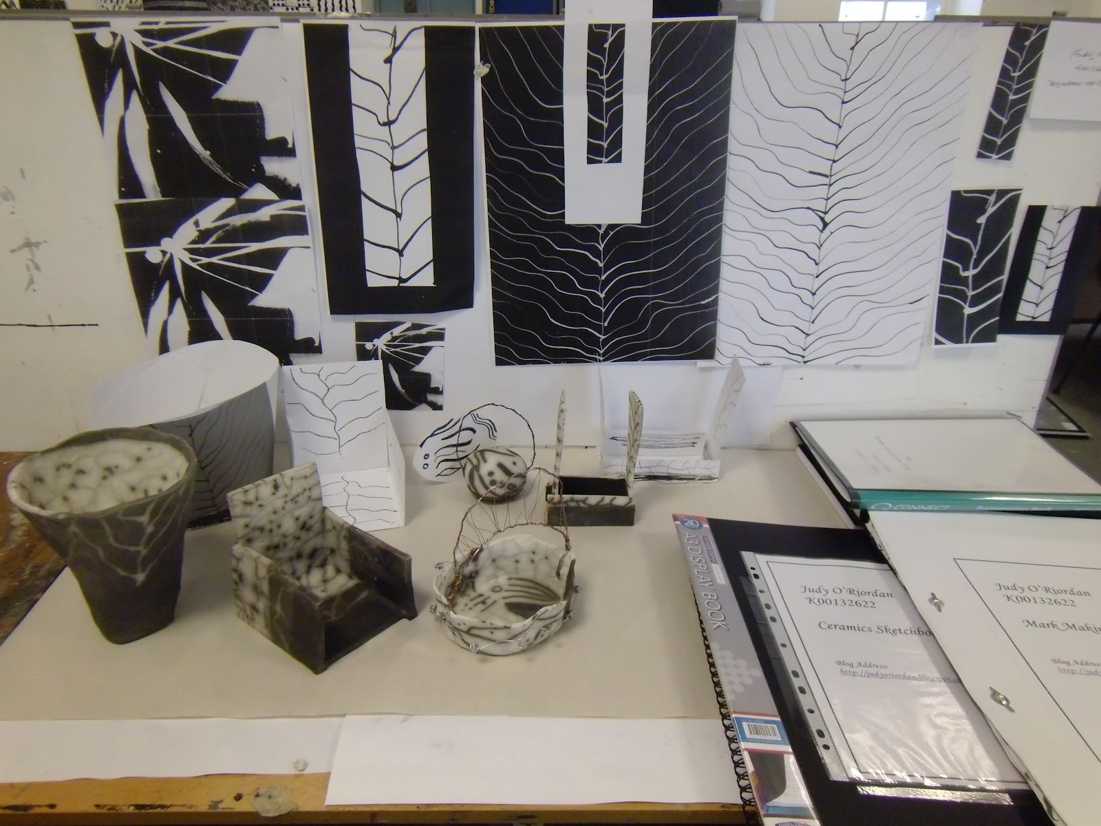
Naked Raku was the process used for decorating most of my pieces. This was done by using a resist slip then crackle glaze on the pieces. They were then fired in an updraft kiln to 1000 degrees. Once removed from the kiln, the pieces were then put into chambers with sawdust and sealed. The flames and smoke need oxygen and the only place to get it was in the clay. This turned parts of the clay, without the slip, black. Here are photos of various stages of the process:


Here are the pieces cleaned up. I have incorporated wire with some of the pieces.


This is the final display for assessment.


I had a great time over the last 2 weeks.

Ceramics Elective

My third elective was Ceramics. To start we had to take photos of patterns / designs we saw in both the natural and urban environment. Here are a few of the pics I took:


We then used our photos to make some marks on paper. In the studio be got paper and indian ink and created marks. Here are the marks I worked with:
Marks made with a plastic clubcard

Marks made with a brush

Positive and negative copies of marks

We then went to the Ceramics Department and were shown coiling, slabbing and how to make pinch pots. I won't bore you with each step, but here are the final pieces I made prior to firing:
This was done by coiling
Coiling also

These are made by the pinch pot technique

This was done by slabbing and adding in coiling to join the edges
Slabbing also

I then had a go at throwing a bowl!!! Well!!! This didn't go so well. I'm calling it my 'Drunken Bowl'! 'Tis a bit lopsided.


Update on Drawing Competition

Well! Ya never guess what!!! One of my pictures got picked for the exhibition!! I'm over the moon!! This is the one that got picked:


It's a great feeling seeing it in an exhibition. My first time! Woo Hoo!!!! It has made me want to go back doing more of these types of drawings. I love doing this kind of thing. I've started already playing around with some ideas. I'll update with more when I have something to share.