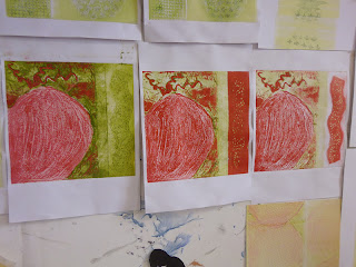
I played around with colour today. I rolled out some yellow and red ink and blended them. I then rolled out my separate blocks and combined the image. I really like these. I think they work really well and you get the feeling of intense heat:
Tuesday, 15 May 2012
Monday, 14 May 2012
Woodblock
A new project! This is a relief print project regarding storytelling. We were to pick a story relevant to ourselves and put this into a single image.
I went with the story of what happened one night after work. I was staying in a 4th floor flat in Limerick with my flatmates. We had some wine and didn't finish the bottle and decided to cork it. Anyway - we went to bed and the next thing I knew was I woke up with one of my flatmates banging on the door and shouting. The flat was on fire. The t.v. had gone up in flames. My flatmate woke up when the wine bottle exploded from the heat. We used the fire extinguishers from the flat and downstairs flat too. Once the fire was out I noticed on the shelf beside the t.v. was a can of Zippo lighter fluid. Thankfully the fire was out before it reached it!!
So, I went and worked on an image for this story. The main elements were the t.v., the wine bottle, lighter fluid and flames.
Here are images of final prints:
Monday, 7 May 2012
Update on more collagraph
Here I worked on the three main colours and my blood's reaction to eating chocolate. Sugar levels soar, then drop, then balance out once I eat something healthy. You can't really see the textures well on these images, but the collagraph board had tile adhesive on it and I crumpled some tin foil and dabbed it on. This was in relation to the red, high levels where they were spikey and rough. The lower part of the board had tissue paper glued on - orange area for low levels. The tissue was put on drooping on the board. Across the centre of the board I put ribbon on. This was showing a smooth baseline. I then used woodglue for the 'lifeline'. I really love how they turned out!

With an extra shade of green
Here I just tried it out on white card just to see the actual texture.
Wednesday, 2 May 2012
More Collagraph
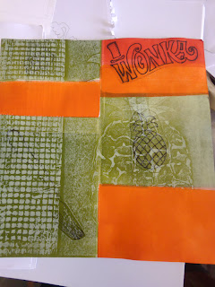
Next I wanted to play with the colours that were relevant to my theme. I rolled out green, orange & red and put them onto acetate to do a monoprint first.
I then cut out some dry point images and inked them up. I then put them on top of the monoprint. To try and bring it together as a collagraph I then blocked off sections (red & orange) and printed the pineapple plate on top. I don't think the dry point parts worked at all, so I stopped with them.
Next I just worked with the monoprint and the collagraphs.
Now I am working on the blending of colours to show the gradual change and fluctuation. Will update once I have something to show.
I then cut out some dry point images and inked them up. I then put them on top of the monoprint. To try and bring it together as a collagraph I then blocked off sections (red & orange) and printed the pineapple plate on top. I don't think the dry point parts worked at all, so I stopped with them.
Next I just worked with the monoprint and the collagraphs.
Spaghetti on green
Now I am working on the blending of colours to show the gradual change and fluctuation. Will update once I have something to show.
Tuesday, 1 May 2012
Collagraph
Next we tried collagraph. This is basically building a collage image on a board and printing it. Making the boards was great fun. Colours needed to be relevant too. The colours I used were green (healthy, balanced levels), red (high levels), orange (low levels).
I first created a board - a pineapple with a grid. The grid is to represent the structure and organisation that has to go behind making sure the right foods are prepared etc. (sorry for sounding boring about it - just need to explain my rationale).
This board was made out of paper, pva glue, masking tape, wood glue carborundum, tile adhesive and french polish to seal it:
Here are some images that I printed:
I didn't really like how the strawberry ones came out, but glad I tried them anyway to see how the textures looked.
Then I cut up some boards and put some different textures on them - tile adhesive, wood glue, carborundum, tissue paper, tin foil and masking tape. I just wanted to play with them just to see how they would print out.
I first created a board - a pineapple with a grid. The grid is to represent the structure and organisation that has to go behind making sure the right foods are prepared etc. (sorry for sounding boring about it - just need to explain my rationale).
This board was made out of paper, pva glue, masking tape, wood glue carborundum, tile adhesive and french polish to seal it:
Here are some images that I printed:
While rolling up, the impression of the pineapple stayed in the ink on the roller. I rolled this out and this is what came out - I like it.
Next I made a plate of a strawberry. I used a paper doiley, tissue paper and acrylic paint, sealed then with french polish:
I didn't really like how the strawberry ones came out, but glad I tried them anyway to see how the textures looked.
Then I cut up some boards and put some different textures on them - tile adhesive, wood glue, carborundum, tissue paper, tin foil and masking tape. I just wanted to play with them just to see how they would print out.
This is to imply spaghetti
The top part has 6 indentations enclosed which is to symbolise the 6 times a day to eat - confinement.
I just played around with reversing the images and seeing what would happen. This was done on thicker paper too.
Subscribe to:
Comments (Atom)


