Saturday, 28 January 2012

Clutter!

We got a side project to do in a day. The title was 'clutter'. Brilliant, I thought!! I have books everywhere at home and thought I could get some good images for this project. Not that I think books themselves are acutal clutter, but for me, I have books everywhere in the house - I like to be able to pick up a book wherever I am at home, and they build up!

We had to present a maximum of  four photos, and choose one to work from. These are the four I chose:


This is the photo I decided to work with:


I wanted to do an abstract print on books. I drew out lines and criss crossed them to represent the randomness of the way books are placed. I then put the acetate over the drawing. I chose different colours to use on the acetate. I mixed some inks up and painted the ink onto the acetate.


I then printed this onto card. I managed to get 3 prints out of one inking, the first one was really strong and full of texture. The second ghost print came out well and the third one was very light. I waited for them to dry.

Next I used another piece of acetate and etched out the corresponding lines. I also inscribed the word 'control?' on it. It's to question the 'clutter'. I inked up the drypoint, used scrim, paper and cloth.

 I then dampened the inked card and rolled the drypoint out. This is a final print. Unfortunately you can't see the colours very well here. There were two shades of blue and a deep red.


 I loved my time in the Print Room! It got a bit chaotic at times and I lost my spot at times when I went to the press, but that couldn't be helped. We all wanted to get as much work done as possible. It was great craic and fingers crossed for the future!!

More Printing!

I then wanted to try something else. I wanted to create a full rainy effect on the paper.
I rolled out black ink on the acetate and splashed white spirit over it. I tilted the acetate to create streaks. I then dabbed off the white spirit, and then put it in the press with one of the pre printed rearview mirror pieces. I then added in elements to the print:


Next I wanted to experiment with colour.

I rolled out some blue on a sheet of acetate and scrunched up some newspaper and pressed lightly. I then printed this onto paper. When the ink was dry, I wet it in the water bath and placed more drypoint elements on it and put it through the press.

Will update with the final print later


Here I played around with rolling red and yellow on acetate and printed it onto a murky, rainy rearview mirror drypoint.


Print Elective

After our assessments after we started our electives. My first elective was print. I was really looking forward to this because I loved it when I did some prints for my assessment. Our brief was on space in our own environment.

I decided to go along with my car, the space in my car and what happens around and in my car. I wanted to have a template of my rearview mirror and different images incorporated into the print.

I started with taking photos. These are images of my route home from college and also of inside my car:


After that I started etching out some images to use for printing. We were to use a standard square size.


I was then ready for the Print Room!!

Des did a workshop showing us how to do drypoint and monoprints. We were then left to our our devices and experiment!
I started with my drypoint of my rearview mirror. I etched out the image on acetate and put ink on the drypoint. I scraped off the excess ink. Next I rubbed scrim (a type of cheesecloth) over it in circular movements. The scrim took off most of the ink that wouldn't be used (ink needed is caught in the burrs on the acetate). Next I rubbed paper (from a phonebook) in circles over the acetate. I had to make sure the paper stayed flat and rubbed gently so as not to take off too much ink. I then cleaned off the acetate around the etching.
I wet the paper in the water bath, used a roller to keep the paper flat and to get some of the water off. Next I put the paper on some clean newsprint and took off some of the water. The paper was now right to print on, damp.
I placed the acetate on the roller and lined up the paper to place on top. Put a piece of newsprint over it, and 2 of the blankets, and started rolling. The above image is what came out.

I then tried adding different elements, like above I added a mug to imply coffee that I like drinking and a radio to imply listening to music while in the car. I tried monoprinting some musical notes on it, but this didn't really work out. As the blue and the red were very strong against the white, the white also standing out and confusing the eye as to what to look at, I decided to add a layer of yellow over it. This improved the image. I'll update with a final photo.

I tried again with various combinations of elements.

Here I was experimenting with a transparency tint. I wanted to try and create a watery kind of effect - as if it were raining and not able to see clearly. I mixed up some green and white and added transparency. I wet the paper and as there were huge cues to use the presses, the paper was almost dry by the time I got to print. It made the paper bend a bit, but it added character to it. Once dry, looking at it, it felt like the car was being submerged! I was happy with the experiment.


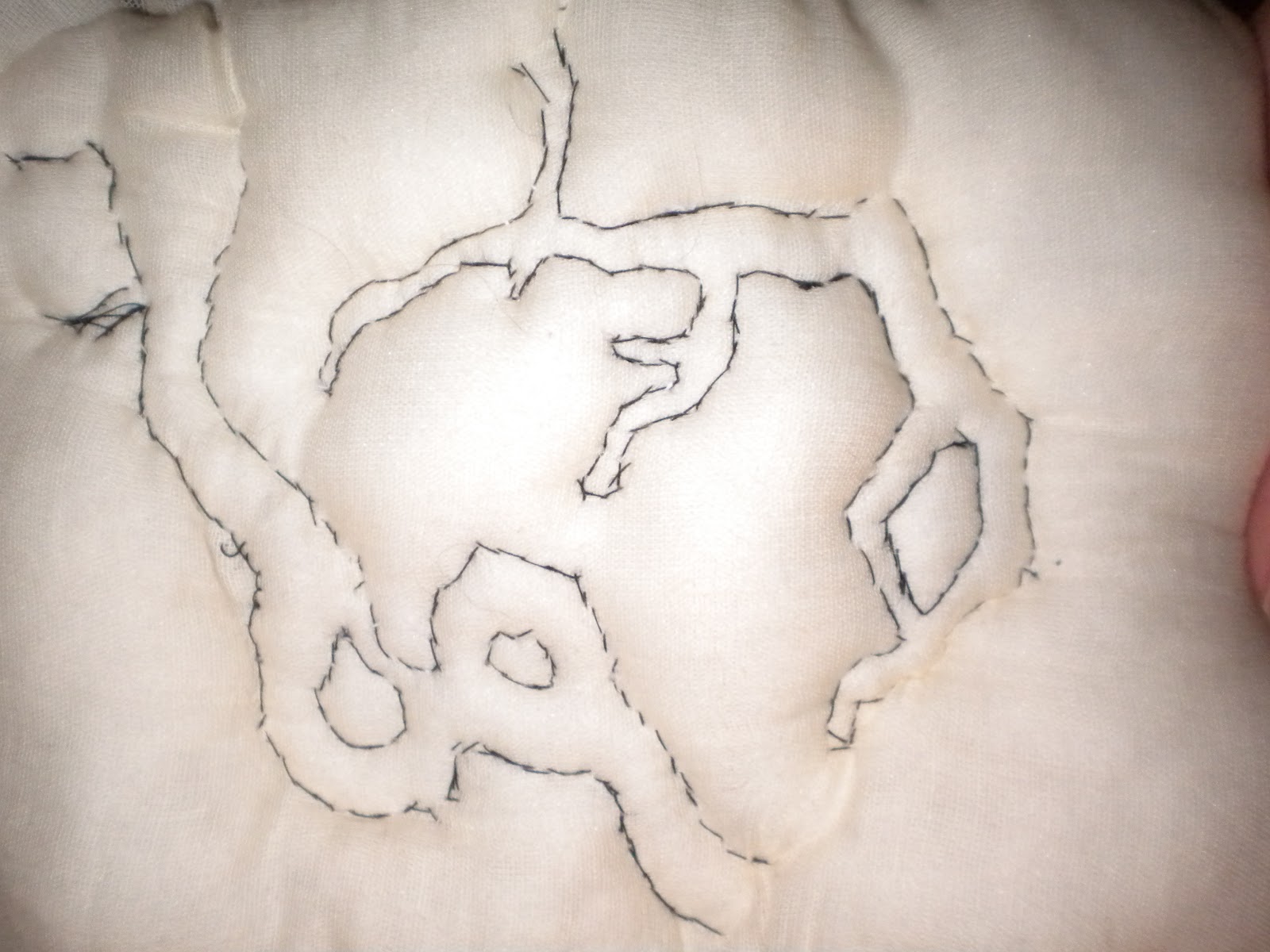
I then wanted to try a different acetate. I drew out a picture with rearview mirror, my hand holding a coffee cup and a tree that I pass every day. I placed acetate over it and started etching.


I rolled out some colours and printed them out. I then inked the drypoint and printed it on the coloured page once dry and dampened from the water bath.


More to come

Saturday, 7 January 2012

Photo & Acrylic Combination

I have been taking quite a few photographs all along and there is one image that I love. It's of branches of trees from out where I grew up. I decided to do a type of collage picture using this photo.

I started by using a primed board. I mixed some acrylic paint with matte fluid and painted directly on to the board. It gave a great effect, blotchy type strokes. I then placed the photo in the painting and it sat into the medium nicely. I waited for it to dry and then I got some black Indian Ink and painted it onto the board from the photo - to extend the branches from the photography itself. The ink left a type of crackling effect. I loved this.


I then added a leaf to the painting, again, by placing it into the medium.


After that I added a piece of handmade paper to the painting. The reason why I did this was because I wanted to add text to it and it felt that it should go onto some beautiful paper. I also wanted to keep the connection between paper and trees.

I then added an image from my paper cutting onto the paper, along with text. These words that I used are words that I feel about trees. I think they are so powerful and strong, and have the ability to withstand the many elements that are thrown at them. Through all this, they continue to grow and move, and create new life.


This is the final picture:


Wednesday, 4 January 2012

Padding Piece

I went back to the images I had taken from my paper cutting and wanted to work with the shapes that I saw. I decided to experiment with padding and top stitching.

First I cut square pieces of cotton and muslin, and also got some stuffing from an old cushion. I teased out the stuffing and put it between the pieces of material.


I then did a running stitch around the edge to secure the stuffing in place.

Next, I pinned an enlarged image onto the padding.

I then stitched around the image.


Once I had stitched what I wanted, then then tore off the paper from the padding.

This is how it ended up.

I loved doing this piece.